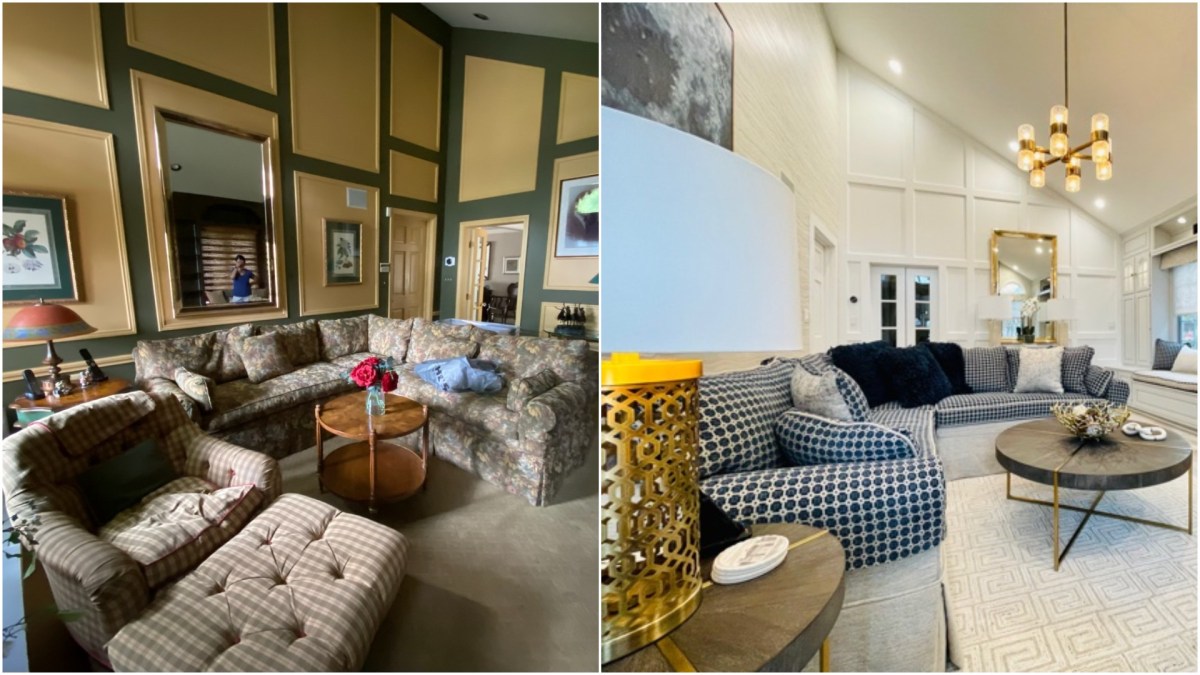
It’s a new year and you’re tired of looking at the same old family room, which has worn out its welcome many, many moons ago.
Giovanni Naso of Giovanni Naso Interiors in Bellport, who recently transformed a Babylon family room with dark and dated walls, fabric, and furniture into an updated, transitional design with clean lines, shows us how he did it.
First Steps
To begin the renovation, Naso removed all the old moldings and reenvisioned the color scheme from dark to light.
“We implemented a design plan for the renovation with carefully curated selections of color, texture, and fabric,” explains Naso.
To give a striking appearance to a space, Naso typically includes some type of feature wall in a renovation: In this case, he added an architectural wall with a boxed-panel effect, then, for a crisp look, painted it bright white.
“A feature wall is unexpected and impactful; it adds texture and contrast, and stands out from the other walls,” says Naso. “Looking at all the same walls in all the same color will tire you over time.”
The room’s built-ins, which were an uninspired dark brown, were sprayed a light-gray hue. The scalloped edges were removed; old hardware was replaced with satin nickel, clean-lined handles, and pulls; and spotlights were added to showcase items.
“We hire professionals to spray the built-ins, which is done with sprayer guns with paint cups attached,” notes Naso.
The built-ins will be used to store accessories, display items, and a TV, and include a bench seat.
From Floor to Ceiling
After removing the wall-to-wall carpet, Naso added a driftwood-like floating floor.
“A floating floor is a man-made, scratch-resistant surface that allows you to go over an existing surface by clicking the pieces together without nailing or glue,” says Naso, adding that it’s similar to a laminate. Next, they added a textured area rug.
“We chose a geometric tone-on-tone pattern rug to go over the floor to create layers and give a cozy feel to the sitting area,” Naso explains.
The sectional, which was the right proportion for the room, was reupholstered with a lively navy and white pattern.
Lighting and Art
With dark tones dominating the original family room, Naso used liberal lighting to brighten the space.
“We updated all the high-hats and put them on dimmers and added a centralized chandelier and spotlight for the built-ins,” he says.
Additional lighting comes from lamps in front of the mirror placed on a console table with a lucite base. “The lamps are tall and regal-looking with a sand color, finished within a highly laminated glass,” Naso says.
For high-impact artwork placed behind the sofa, Naso hired a muralist to custom paint a 4-foot-by-4-foot abstract painting, using the same color palette as fabrics they’d selected for the room design.
Most accessories, now out of fashion, were discarded and switched out with blue and white accents that worked seamlessly with the overall design.
“The one item we returned was the mirror,” says Naso. “We thought it was lovely to begin it, so it made its way back to adorn the room.”
Be Patient
For Naso’s family room redo, the project, from start to finish took six months. The demolition happened in different waves, according to scheduling and availability of textiles, wood for the feature wall, flooring, wall covering, and paint, as well as the various trades.
“Every trade has a different strength, such as a good wall-covering installer, a molding expert, floor installer, and painter,” Naso says.
And, of course, there is a backed-up supply chain to consider.
Sign up for Long Island Press’ email newsletters here. Sign up for home delivery of Long Island Press here. Sign up for discounts by becoming a Long Island Press community partner here.


